Customise the launcher and look
Under Launcher and look you decide how the widget announces itself and what customers see when it opens.
Five steps
Open Launcher and look
Choose Widget in the sidebar and scroll to Launcher and look.
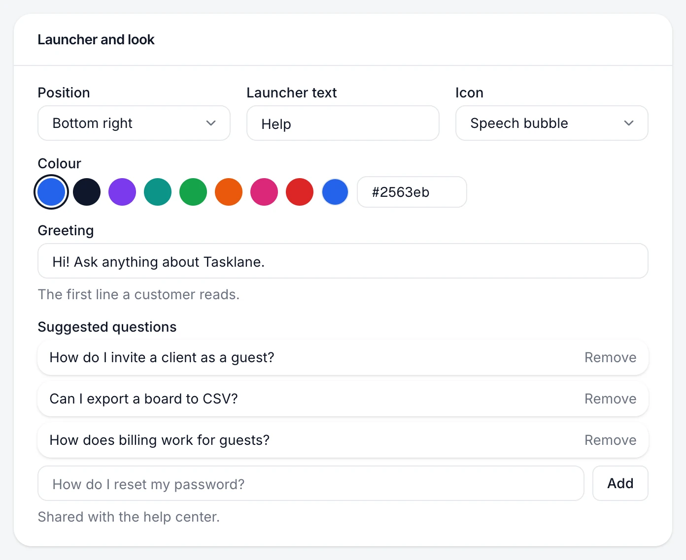
Choose the corner and the button
Position puts the launcher at Bottom right or Bottom left. Launcher text is the word on the button (for example "Help"), and Icon is a Speech bubble, Question mark, Sparkle or Book.
Set the colour
Colour is used for the launcher and the widget's accents. It's the same setting as your help center's Brand colour, so the two always match.
Write the greeting and suggested questions
The Greeting is the first line a customer reads. Suggested questions are one-tap prompts; the list is shared with your help center.
Save
Choose Save changes. The preview updates as you type, before you save.
The preview shows your launcher, colour and greeting.
If something's not right
The launcher covers my own chat or cookie banner
Move it to the other corner with Position, or hide the launcher and open the widget from your own button with data-launcher="false" and PageTruth.open(). See Control the widget from your code.